Subscribe to the Newsletter
Your cart is empty
Shop now


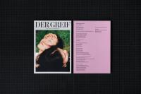
Der Greif X Dinamo: unveiling issue 16 Diatype typeface
Dinamo is a type design agency based in Berlin. They offer a range of services including retail and bespoke typefaces, design software, research, and consultancy. Operating through a global network of satellite members, Dinamo works on commercial and cultural projects of all sizes. The agency's members are visiting teachers at various art academies and have been invited to give workshops and lectures at international institutions. In recognition of their work, Dinamo was awarded the Swiss Design Award by the Swiss Federal Office of Culture in 2017. Moreover, in 2018, the co-founders of the foundry, Johannes Breyer and Fabian Harb, became members of the AGI.
Dinamo has played a significant role in the creation of Der Greif’s issue 16 and website, and they are also well-known for their involvement in book and zine publishing. Recently, they launched a new publishing imprint called “Dinamo Editions” which features a fresh series of books showcasing their fonts and artistic direction's aesthetics.
Madeleine Morley, Head of Publishing at Dinamo, recently had a conversation with Der Greif about her favorite photography publications that have utilized their typefaces. These books were all created by the same designers who collaborate on a daily basis, sharing everything from kitchen knives and coffee filters to printer cartridges and pasta lunches. During her visit to their Berlin studio, which they also share with book graphic designers, Madeleine had the opportunity to explore the various ways in which the Diatype typeface has been employed in creative publications.
“The Playground Project” (3rd edition). Published by Park Books (2023). Designed by Dan Solbach, featuring ABC Oracle.


"This book is a captivating exploration of the social history of open-air playgrounds worldwide. Through a captivating collection of images, it invites you to embark on a journey through an imaginative and dream-like world of architectural spaces. Notably, this is Dan Solbach's third design for the book, which includes additional material and research. It is the first time Solbach has paired Dinamo ABC Oracle with such a specific topic. I particularly appreciate how the smooth contours and subtle contrast of our friendly sans-serif font lend an architectural touch to "The Playground Project". Take note, for instance, of how the placement of the letter "Y" on the cover resembles a tubular slide."
“Wandering About History. The Photography of Urlich Wüst.” Published by Spector Books (2023). Designed by Lamm & Kirch, featuring ABC Diatype.


"Released last year, this duo-language monograph combines Dinamo's neutral and sharp Grotesque with precise observational photography by Ulrich Wüst. Wüst explores the history of a divided Germany and its long process of reunification, reflecting on overcoming historical division and social change through stark images of factory workers, Stalinist architecture, historic memorials, and other urban scenes where histories intertwine. Each photograph presents a meticulously composed statement. I find that Diatype works well in these contexts, allowing the work to speak for itself while enhancing the reading experience with its warm and robust presence on the pages."
“Die Eiche. Werner Mahler.” Ostekreuz (2020). Designed by Florian Lamm (Lamm&Kirch) featuring ABC Monument Grotesk.


"This is a book of few words but when words do appear, they leave a lasting impact. The cover features Dinamo's Monument Grotesk typeface in its boldest weight, expertly embossed on a sturdy orange card. The typeface takes on a weighty, solid presence, akin to the unwavering and dependable oak tree that serves as the central figure in this publication. The square-shaped pages chronicle four decades in the life of the tree located outside Mahler's window. Through his photographs, we witness the tree's endurance under various weather conditions - from sun to rain, fog to lightning, and even snow. I admire the simplicity and tranquility of this project, which serves as a gentle reminder of the gradual passage of time and the elements that remain constant. It encourages us to pause and appreciate the everyday observations that surround us."